Afrina Kugelstadt
Enhancing Skill Matrix:
Clear Visual Cues for Better State Identification
Skills Management Software
Service
Research
Concept
Storypoints
13
Year
2025
Context
This project focused on a skills management platform that helps companies keep track of employee qualifications and match them with role requirements. It's especially useful for teams that need to stay compliant or quickly see where there are skill gaps.
Problem
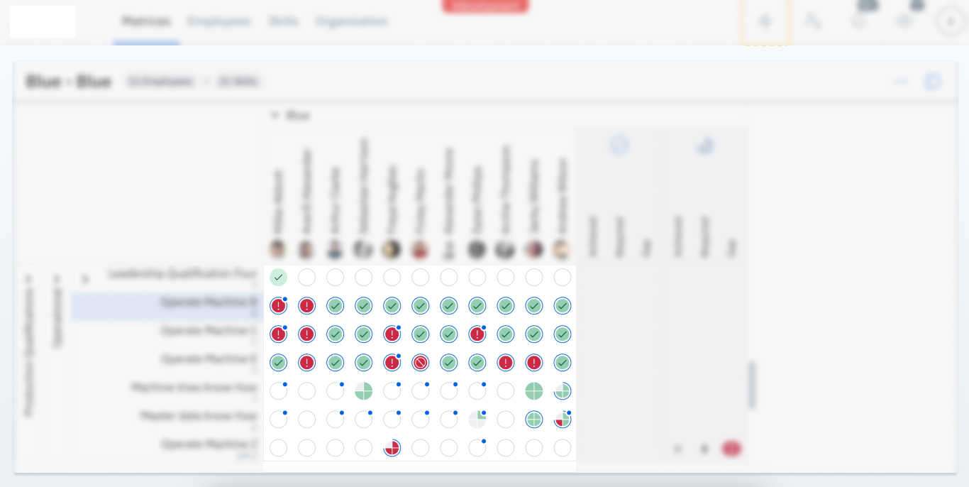
On the Skill Matrix page, a single blue add-on with an icon was used to represent three different statuses: Plannings, Open Requests, and Waiting for Approval. Because all three states shared the same visual style, users found it difficult to distinguish between them. This lack of clarity led to confusion and frequent misinterpretation of the information presented.
Before

Process
- Researched the status add-on visualisation and it’s meaning
- Designed and tested multiple iterations with internal colleagues
- Collaborated with visual design experts to refine options
- Presented the final solution to the client and handed it off to the Product Owner (PO)
Design Iterations
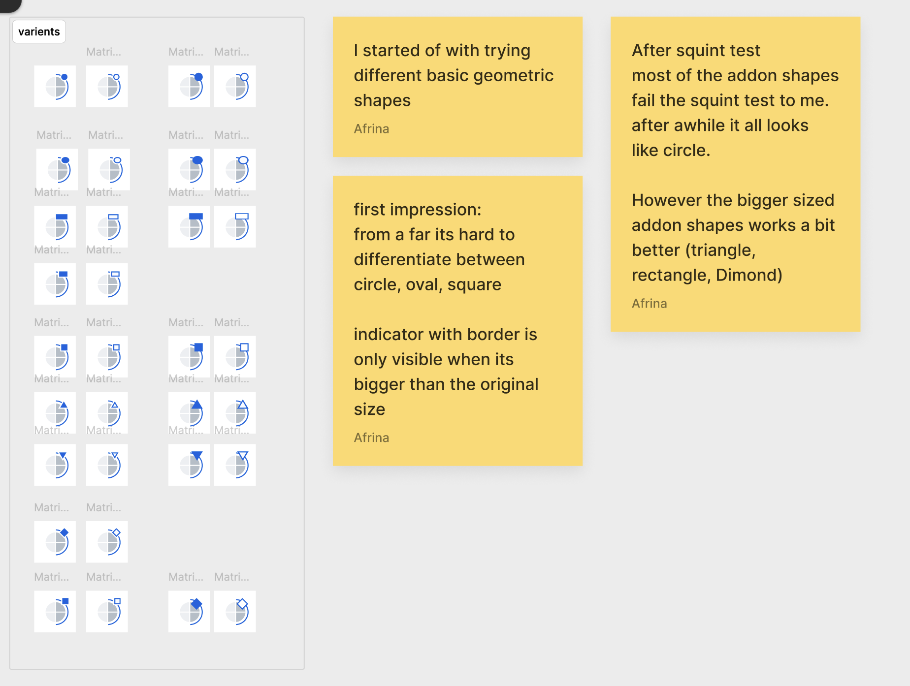
The iterations were divided into two parts: shape exploration came first, followed by experimentation with colors.

Challenges
Small Add-On Icon Size
The small size of the add-on icon makes it difficult for users to notice and interpret its meaning, reducing its effectiveness as a visual cue.
Visual Overload in the Matrix
When combined with the dense structure of the skill matrix, the add-on icons create a cluttered appearance, making it harder for users to quickly identify areas of need.
Suggested Solution
Before
After

More to explore
Afrina Kugelstadt
afrina.design
Afrina Kugelstadt
Service
Research
Concept
Storypoints
13
Year
2025
Context
This project focused on a skills management platform that helps companies keep track of employee qualifications and match them with role requirements. It's especially useful for teams that need to stay compliant or quickly see where there are skill gaps.
Problem
On the Skill Matrix page, a single blue add-on with an icon was used to represent three different statuses: Plannings, Open Requests, and Waiting for Approval. Because all three states shared the same visual style, users found it difficult to distinguish between them. This lack of clarity led to confusion and frequent misinterpretation of the information presented.
Before

Process
- Researched the status add-on visualisation and it’s meaning
- Designed and tested multiple iterations with internal colleagues
- Collaborated with visual design experts to refine options
- Presented the final solution to the client and handed it off to the Product Owner (PO)
Design Iterations
The iterations were divided into two parts: shape exploration came first, followed by experimentation with colors.


Challenges
Small Add-On Icon Size
The small size of the add-on icon makes it difficult for users to notice and interpret its meaning, reducing its effectiveness as a visual cue.
Visual Overload in the Matrix
When combined with the dense structure of the skill matrix, the add-on icons create a cluttered appearance, making it harder for users to quickly identify areas of need.
Suggested Solution
More to explore
Afrina Kugelstadt
afrina.design
Afrina Kugelstadt
Enhancing Skill Matrix:
Clear Visual Cues for Better State Identification
Skills Management Software
Service
Research
Concept
Storypoints
13
Year
2025
Context
This project focused on a skills management platform that helps companies keep track of employee qualifications and match them with role requirements. It's especially useful for teams that need to stay compliant or quickly see where there are skill gaps.
Problem
On the Skill Matrix page, a single blue add-on with an icon was used to represent three different statuses: Plannings, Open Requests, and Waiting for Approval. Because all three states shared the same visual style, users found it difficult to distinguish between them. This lack of clarity led to confusion and frequent misinterpretation of the information presented.
Before

Process
- Researched the status add-on visualisation and it’s meaning
- Designed and tested multiple iterations with internal colleagues
- Collaborated with visual design experts to refine options
- Presented the final solution to the client and handed it off to the Product Owner (PO)
Design Iterations
The iterations were divided into two parts: shape exploration came first, followed by experimentation with colors.


Challenges
Small Add-On Icon Size
The small size of the add-on icon makes it difficult for users to notice and interpret its meaning, reducing its effectiveness as a visual cue.
Visual Overload in the Matrix
When combined with the dense structure of the skill matrix, the add-on icons create a cluttered appearance, making it harder for users to quickly identify areas of need.
Suggested Solution
Before

After

More to explore
Afrina Kugelstadt
afrina.design

